
There’s a specific kind of decorating anxiety that hits when you own a beautiful cognac leather sofa and fall in love with a bouclé armchair — or inherit a chocolate leather sectional and need to furnish the rest of the room around it. The instinct is to either match everything in leather or avoid the material altogether, neither of which serves the room. What most people don’t realize is that the mix itself isn’t the problem. The execution is.
Combining leather and fabric furniture is one of the most effective techniques in contemporary interior design, adding textural contrast and visual depth that identical-material rooms simply cannot achieve. The key lies in three things: maintaining a unified color temperature across both materials, deliberately orchestrating texture contrast rather than avoiding it, and using transitional elements — rugs, pillows, throws — to stitch the two into a coherent whole. Rooms that do this well don’t look compromised. They look curated.
Why Designers Prefer Mixed-Material Rooms Over All-Matching Sets
Walk through any high-end hotel lobby, flip through an editorial spread in Architectural Digest, or visit a well-appointed furniture showroom, and you’ll notice the same thing: nothing matches perfectly. The leather chair sits beside a velvet bench. A fabric sofa anchors the room while a leather ottoman grounds the coffee table area. This isn’t an accident or a budget constraint — it’s an intentional design philosophy.
Contemporary interior design has largely moved away from the matching set as an aesthetic ideal. Buying a three-piece suite where sofa, loveseat, and armchair share identical upholstery is now considered a visual shortcut — it signals that the room was furnished in a single afternoon rather than assembled with considered intention. The principle that replaced it is coordination without uniformity: pieces that share a relationship through color, scale, or era, rather than through identical material.
Mixed-material rooms also simply read as more layered. Leather has a density and visual weight that fabric doesn’t — it anchors space. Fabric, conversely, offers warmth, softness, and the ability to introduce pattern or texture that leather rarely can. Used together, they create a natural tension that makes a room feel alive. Interior designers refer to this as textural hierarchy — the deliberate assignment of different materials to different roles within the same visual composition.
The underlying rule is cohesion, not conformity. Two pieces don’t need to be made from the same material to belong in the same room. They need to speak the same design language.
The 3-T Method: A Framework for Pairing Leather and Fabric Successfully
Most advice on how to combine leather and fabric furniture treats it as a matter of taste or intuition. It isn’t. There are three specific variables that determine whether a mixed-material room looks deliberate or accidental, and understanding each one removes the guesswork entirely. This framework — Tone, Texture, and Transition — covers every scenario you’re likely to encounter.
Tone: Color Temperature Is More Important Than Color Matching
The most common error when pairing leather and fabric isn’t a color clash — it’s a temperature clash. Leather, particularly in natural hides, tends to carry warm undertones: amber, golden, reddish-brown, even warm grey. Fabric comes in the full spectrum of warm and cool. Put a cognac leather sofa next to an icy blue linen chair, and the room feels unsettled without anyone being able to articulate exactly why. The two pieces are reading from different color climates.
The fix isn’t to match colors exactly — it’s to match temperature. Warm leather pairs with warm fabric: cognac with oatmeal linen, tan with rust velvet, espresso with dusty terracotta. Cool leather — charcoal, slate, pale cream — pairs with cool fabric: slate blue wool, cool grey velvet, soft white linen with blue undertones. When both pieces occupy the same temperature range, the room feels resolved even when the actual colors differ significantly.
Analogous color palettes are particularly effective here, since they naturally stay within a shared temperature zone. If you’re starting from scratch, choosing leather and fabric within the same analogous range eliminates the risk of undertone conflict before it starts.
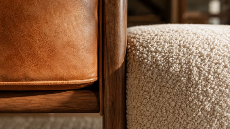
Texture: Contrast Is the Point, Not the Problem
Texture contrast between leather and fabric isn’t something to minimize — it’s the central value of combining the two materials at all. The goal is to choose a level of contrast that feels intentional rather than random, and to understand that different contrast levels produce different emotional registers in a room.
High contrast — smooth top-grain leather against chunky bouclé or nubby tweed — creates a room with energy and visual tension. It’s the combination most often seen in design-forward, editorial-influenced interiors. Medium contrast — distressed leather alongside linen or soft cotton weave — produces something warmer and more relaxed, almost farmhouse-adjacent. Low contrast — matte leather with matte canvas — reads as understated and deliberate, often found in minimalist or Japandi-influenced spaces.
What doesn’t work is same-sheen pairing: patent or high-gloss leather next to silk, satin, or any similarly lustrous fabric. When two materials compete for visual reflectivity, neither wins. One material always needs to recede slightly — and matte fabric is almost always the better choice for letting leather lead.
Transition: The Elements That Make the Mix Look Deliberate
Even a perfectly tone- and texture-matched pair of leather and fabric pieces can still look like two unrelated objects in the same room without transitional elements doing their quiet work. Transition is what tells the eye that the combination was chosen, not settled for.
The most powerful single transitional element is an area rug that contains both warm and cool tones from the existing pieces. A rug essentially functions as a translation layer — it repeats colors from each material in the room and pulls them into a shared visual field. After a rug, throw pillows serve the same function at a smaller scale: a leather pillow on a fabric sofa, or linen cushions on a leather chair, physically demonstrate that the two materials can coexist by placing them on the same piece.
Mixed-material furniture — a coffee table with leather upholstery and a fabric-trimmed edge, or a bench with a wooden frame bridging both a leather sofa and fabric curtains — performs transition at the object level. Warm wood tones in particular are extraordinarily useful in mixed-upholstery rooms because walnut, oak, and teak all carry warmth that harmonizes with both leather and natural fabric.
Room-by-Room Playbook: Combinations That Actually Work
Understanding principles is one thing. Applying them to a specific room with specific constraints is another. The following combinations move from concept to practice, covering the most common spaces where the leather-and-fabric question actually arises.
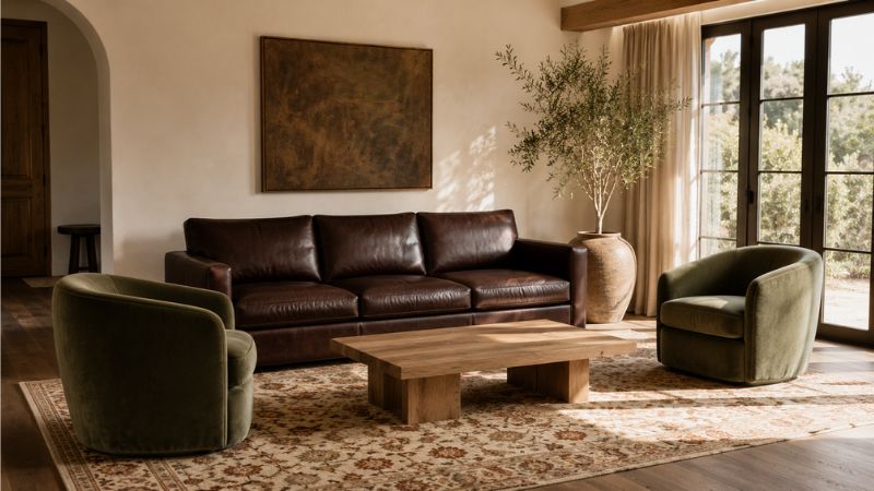
Living Room: The Anchor-and-Accent Method
The living room is where most people encounter this challenge, and the most reliable approach is establishing a clear hierarchy between the two materials. One piece anchors the room — typically the largest seating element, most often the sofa. The other pieces accent it. Assigning roles prevents both materials from competing for visual dominance, which is what makes a mixed room feel chaotic rather than composed.
If the anchor is a leather sofa, the accent chairs should be in fabric — ideally a softer, warmer texture that allows the leather to read as the primary surface. Two linen or bouclé armchairs flanking a leather three-seater is among the most commonly seen combinations in professionally designed living rooms precisely because it works so reliably. The reverse also holds: a large fabric sectional absorbs visual space while a leather chaise or reading chair adds material contrast without competing for dominance.
Specific combinations worth considering: a cognac leather sofa with cream bouclé armchairs; a charcoal leather loveseat with slate velvet side chairs; a warm tan leather chaise alongside a greige fabric sectional. In each case, the anchor is neutral enough to absorb the room’s visual weight while the accent piece introduces the textural counterpoint.
Open-Plan Spaces: Using Materials to Define Zones
Open-plan living presents a specific version of this challenge: multiple zones sharing a continuous sightline. Here, mixed materials become a functional tool rather than purely an aesthetic one. Assigning a primary material to each zone — leather in the conversation area, fabric in the reading nook — creates visual separation without physical barriers.
The discipline required is restraint at the transitions. Where zones meet, the bridging piece (typically a rug) should contain references to both material palettes. A single wool rug with warm and cool tones woven through it can negotiate between a leather-anchored seating group and a fabric-heavy reading corner, making the transition feel planned rather than coincidental.
Bedroom and Home Office: Purposeful Secondary Pairings
The bedroom offers some of the cleanest applications of this principle. A fabric upholstered headboard paired with a leather bench at the foot of the bed is one of the most designer-favored combinations in residential interiors — the softness of the headboard fabric stays adjacent to the human body, where tactile comfort matters most, while leather’s durability makes it ideal for the bench, which absorbs both seated use and the occasional bag or clothing pile.
In a home office, the functional argument for mixed materials is equally clear. A leather desk chair performs where fabric can’t — it wipes clean, resists wear, and maintains its shape under sustained daily use. Fabric on walls in the form of acoustic panels, or on windows as curtains, introduces the softness that makes a working environment feel less institutional, while each material is clearly earning its placement through utility.
The 5 Mistakes That Make Mixed Furniture Look Mismatched
Knowing what works is useful. Knowing what goes wrong — and why it goes wrong at the perceptual level — is more useful still. Most mixed-material rooms that don’t succeed aren’t failing because the materials are incompatible. They’re failing for one of five specific, avoidable reasons.
Mixing warm-toned leather with cool-toned fabric. This is the undertone conflict described in the Tone section above, and it’s the root cause of most “I can’t quite put my finger on it” reactions to a room that looks off. The eye detects temperature inconsistency even when the conscious mind can’t name it. A tan leather sofa and a cool grey linen chair occupy different climate zones, and no amount of throw pillows entirely resolves that.
Giving both materials equal visual weight. When leather and fabric compete on even terms — same size, same visual mass, no clear hierarchy — the room reads as indecisive. The eye doesn’t know where to rest. The anchor-and-accent principle exists specifically to solve this: one material leads, the other supports. Abandoning that hierarchy in favor of “balance” usually produces visual noise instead.
Ignoring scale and proportion. A large leather sectional that fills two-thirds of a living room is not a match for a single small fabric side chair. The disproportion doesn’t just look strange — it makes the fabric piece seem like an afterthought. Scale between the anchor and accent pieces should be in rough proportion: a large leather sofa calls for substantial fabric chairs, not petite occasional seats.
Era mismatch between pieces. Materials can coexist across styles, but furniture eras rarely can without an explicit bridge. A sleek, tightly upholstered mid-century leather chair does not naturally share space with an overstuffed traditional fabric sofa, regardless of color coordination. Each piece is referencing a different moment in design history, and the contrast reads as confusion rather than eclecticism. Keeping pieces within one to two adjacent eras — or using transitional-style pieces that don’t commit to a specific decade — sidesteps this entirely.
Skipping the transitional layer entirely. Two well-chosen pieces can still fail to cohere if there’s nothing in the room tying them together. A leather armchair and a fabric sofa with nothing between them — no rug, no shared pillow language, no connecting wood tones — look like furniture from two different households. The transitional layer isn’t decorative excess. It’s structural.
Leather and Fabric Color Pairing: A Reference Guide
Color decisions are where most people spend the most time and make the most avoidable errors. The table below is a practical reference, organized by leather color, and reflects the warm/cool temperature principle applied to specific pairing scenarios.
| Leather Color | Best Fabric Pairings | Pairings to Avoid |
| Cognac / Tan | Cream linen, sage velvet, rust bouclé, oatmeal wool | Cool grey, icy blue, cold white |
| Espresso / Dark Brown | Oatmeal, ivory, dusty rose, forest green, camel | Black fabric (too heavy overall) |
| Charcoal / Dark Grey | Blush, warm white, mustard, camel, warm taupe | Cold blue-white, stark cool grey |
| Black | Camel, terracotta, warm ivory, deep olive | Navy (too dark), cool silver |
| Caramel / Medium Brown | Teal, warm navy, olive, rust, sage | Bright white (stark contrast) |
| White / Cream Leather | Warm navy linen, slate, charcoal, dusty blue | Beige fabric (too similar, no contrast) |
| Saddle / Warm Tan | Burnt orange, dark teal, chocolate brown, deep cream | Pastel lavender, cool mint |
The overarching rule embedded in this table: leather almost always reads warm, so cool-toned fabric pairings require a warm bridge element — a wood-toned frame, a warm-hued rug — to prevent the combination from feeling disconnected.
How to Shop for a Second Piece When You Already Own One
This is the question almost no decorating guide addresses directly, and it’s one of the most practically useful things to understand about leather and fabric combination. Most people aren’t furnishing a room from scratch — they own one piece and need to find something that works with it.
The first rule is to never shop from memory. Leather in particular shifts dramatically under different lighting conditions — a tan leather sofa that looks warm honey in your living room may read as greenish-gold under fluorescent store lights. Bring a photograph taken under natural light, or better, bring a small leather swatch from a hidden seam or cushion underside. Fabric swatches from existing textiles in the room — curtains, a rug, even a throw — are equally valuable.
When evaluating a candidate piece in-store, assess it under natural light wherever possible, or near the entrance. Identify its undertone independently of the leather piece before comparing: is this fabric warm or cool? Does it occupy the same temperature range as what you own? Color match is secondary to temperature match — a fabric that’s slightly different in hue but shares the leather’s warmth will work. A fabric that matches the hue but sits in a cooler register won’t.
Consider durability when assigning materials to different use contexts. Leather outperforms fabric in high-traffic positions — a primary sofa, a desk chair, a frequently used ottoman. Fabric is better suited to lower-impact positions: accent chairs used occasionally, bedroom benches, decorative cushions. Matching material to use case means both pieces age gracefully rather than one wearing out while the other stays pristine.
Organizations like BIFMA (Business and Institutional Furniture Manufacturers Association) publish durability standards for upholstery by use category — a useful reference if longevity is a significant concern in the purchase decision.
Design Movements That Handle the Leather-Fabric Mix Best
Certain design aesthetics are built around the leather-fabric pairing as a core principle rather than an occasional choice. Understanding which movement your room most closely aligns with gives you a ready-made vocabulary of specific combinations that have proven track records.
Mid-Century Modern is perhaps the most natural home for this combination. The aesthetic pairs leather chairs — Eames lounge, Barcelona, Saarinen Womb — with wool or tweed fabric sofas as a matter of historical convention. Warm teak and walnut frames bridge both materials effortlessly. If your room leans mid-century, the combination isn’t just acceptable — it’s canonical.
Industrial interiors use the material contrast as a reflection of the aesthetic’s broader embrace of tension: raw and refined, hard and soft. Distressed leather alongside canvas, denim-woven fabric, or heavy linen reads as intentional roughness — each texture is doing the same work in a different material language.
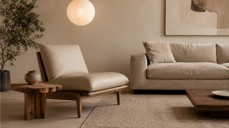
Japandi — the fusion of Japanese minimalism and Scandinavian functionality — handles this pairing with particular elegance. Pale, undyed leather alongside natural linen in sand or warm white creates maximum textural contrast at minimum color contrast, which is precisely the Japandi sensibility: complexity through restraint. Every piece earns its place through simplicity of form and purity of material.
Transitional style is explicitly built for mixed materials. As a design movement, it exists to bridge traditional and contemporary, and leather-and-fabric combination is one of its primary tools. If your room is already transitional, you have the widest latitude of any style in terms of what pairings will work.
Eclectic and maximalist interiors take the most liberties, using bold or unusual leather — jewel-toned, heavily textured, or patterned — alongside richly patterned fabric. Here, the unifying principle isn’t temperature or even tone, but the repetition of a single color or motif that appears in both pieces and ties the room together.
Frequently Asked Questions
Can you put a leather sofa with a fabric sofa in the same room?
Yes — the key is ensuring both sofas share the same color temperature and that one reads as visually dominant. Place them in the same warm or cool tonal family, use a rug beneath to anchor both pieces within a single zone, and avoid matching them in size, which creates a competition for visual authority rather than a hierarchy.
Does leather furniture go with linen?
Leather and linen are one of the most reliably successful material pairings in contemporary interiors. Their textures sit at opposite ends of the tactile spectrum — dense and smooth against loose and nubby — creating intentional contrast without visual noise. Keep them in the same warm tonal family for best results: cognac leather with oatmeal linen is a near-universal success.
What fabric goes best with a brown leather sofa?
Warm neutrals perform best alongside brown leather: oatmeal, cream, warm ivory, and dusty taupe are the most reliable choices. Earthy saturated tones — olive, rust, sage, forest green — also work well by complementing leather’s natural warmth. Avoid cool whites and icy blues, which clash with the warm undertone present in most brown leather.
Is it okay to mix different sofa styles in the same room?
Yes, with one important condition: the pieces should share at least one of the following — design era, scale, or color temperature. A mid-century leather sofa can sit beside a contemporary fabric chair if both maintain clean lines and a unified palette. The most common failure mode is mixing furniture from eras too far apart without a bridging element.
How do you make a leather sofa look less harsh in a soft room?
Introduce fabric throw pillows in natural textures — linen, bouclé, cotton knit — directly on the leather sofa. Layer a soft area rug with warm tones beneath it. Add warm wood elements nearby, such as a side table or floor lamp base in walnut or oak. Each of these steps softens the leather’s visual rigidity without diminishing its presence.
Should the leather or fabric piece be the focal point of the room?
Generally, the larger piece — most often the sofa — should serve as the visual anchor and focal point. If your sofa is leather, keep fabric accent pieces softer and more neutral so the leather leads. If your sofa is fabric, leather accent chairs or an ottoman can introduce material contrast without competing for dominance. The principle is hierarchy, not equality.
The One Principle That Covers Everything
Every rule in this guide — temperature matching, texture contrast, transitional elements, era cohesion — is a specific expression of a single underlying idea: unity through variation, not uniformity. The best-designed rooms don’t repeat the same surface across every piece of furniture. They find a shared language and let different materials speak it.
When leather and upholstered fabric coexist well, the room feels like it was assembled by someone who understood what each material does best and assigned each one its proper role. That’s not a matter of matching. It’s a matter of intention — and intention, once understood, is entirely learnable.
